现代东方纸纤维美学历史文化海报
现代东方纸纤维美学历史文化海报,适合短视频封面、AI生图、AI视频分镜和内容创作参考。模型:ChatGPT。
AI提示词短视频灵感
现代东方纸纤维美学历史文化海报,适合短视频封面、AI生图、AI视频分镜和内容创作参考。模型:ChatGPT。
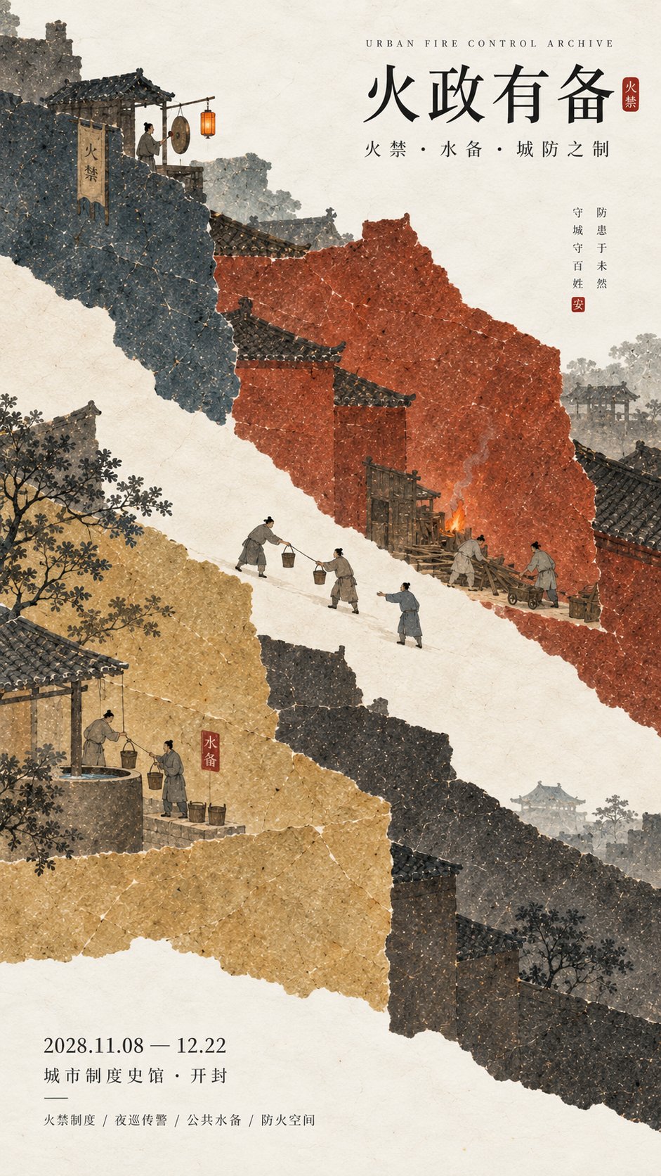
图片来自公开来源,仅作提示词效果参考;正式商用请按来源授权处理。
[Theme / Exhibition Name] {Fill in, e.g.: Urban Fire Prevention / Ice Storage System / Maritime Trade Clearance / Voucher Verification}
[Main Title] {Fill in}
[Core Institutional Logic] {Fill in, e.g.: Alarm → Fetch water → Block fire / Storage → Preservation → Retrieve ice / Check records → Seal goods → Release / Combined verification → Passage}
[Main Space Mechanism] {Fill in, e.g.: Gamut cutting / Shallow outside deep inside / Diagonal sails / Left-right complementarity}
[Main Color Gamut] {Fill in 3–5 colors, e.g.: Brick Ocher + Charcoal Black + Gray-Blue / Ice Gray-Blue + Deep Indigo + Warm Ocher / Ink Sea Blue + Sea Pine Green + Old Sail Yellow}
[Microscopic Scenes] {Fill in 2–4 real actions related to the institution}
[Key Visual Nodes] {Fill in, e.g.: Firebreak cut / Hot and cold boundary / Continuous rope / Cross-seam mark}
[Exhibition Information] {Date / Venue, optional}
[Aspect Ratio] 9:16 Vertical

Design a historical and cultural exhibition poster with modern Oriental editorial aesthetics, using "paper fiber + large color gamut + micro scenes" as the core visual language. Do not paint ordinary ancient style scenes first, but first extract the [Core Institutional Logic], and then directly transform the [Main Space Mechanism] into the first visual of the entire screen, letting large areas of paper color gamut bear abstract relationships such as "blocking, deepening, connecting, verifying, passing, and storing."

Use the [Main Color Gamut] to establish 3–5 large handmade paper color blocks with significantly different areas. All color blocks have real and rich natural long and short fibers, pulp particles, mineral or plant pigment deposits, large-scale natural color differences, slight indentations, and irregular torn paper edges, keeping the overall matte, clean, complete, and weighty. When viewed from a distance, the clear large shapes, colors, and spatial relationships are seen first; only when viewed closely are the paper fibers and character details discovered. Avoid dirt, yellow spots, random mottling, strong noise, digital gradients, plastic feel, and CG texture.

Choose the most appropriate spatial mechanism according to the theme, do not mechanically apply templates. You can use a clear negative space cut to express "isolation," use layers of paper fields from shallow to deep to express "storage and depth," use large diagonal paper fields and thin ropes to express "navigation and customs clearance," and use two complementary paper color gamuts on the left and right to express "joint inspection and certification." Large color gamuts are not backgrounds, but visualized expressions of the theme itself.

Embed [Microscopic Scenes] into the large paper color gamut, with figures, artifacts, and tools generally controlled at about 3%–6% of the frame. Figures must perform real actions directly related to the institution, such as sounding alarms, fetching water, clearing obstacles, carrying, checking records, sealing goods, submitting vouchers, verifying, releasing, etc., rather than standing for poses. If the theme has a process, 2–4 small nodes with causal relationships can be set up, but do not make them into flowcharts, step cards, or storyboard frames; scenes should be naturally hidden in the large color gamuts and spatial nodes, letting the audience discover the complete story after approaching.

Add a clear but restrained [Key Visual Node], such as a fireproof negative space, a hot and cold boundary, a continuous hemp rope, a cross-seam vermilion seal, a sealing tag, or a small point of warm light. This node must have a real relationship with the institutional logic, rather than being a random decoration for "Oriental feeling." Accent colors like cinnabar red, warm orange, and old gold are usually controlled at 1%–5% of the total area.

Keep figure clothing and environment restrained, retaining only necessary elements to help understand the theme. Do not stack ancient buildings, auspicious clouds, flowers and birds, lanterns, landscapes, scrolls, seals, or large amounts of calligraphy. The scale of the figures should be small, the actions real, and the clothing low in saturation, avoiding the feel of film and television costume blockbusters. Concrete content always serves the large color gamut and institutional narrative, and does not grab the main visual.

Typography uses the Oriental editorial language of modern museums, historical archive exhibitions, and institutional history exhibitions. The main title [Main Title] uses slender, upright Chinese Songti, Mingti, or modern fonts with a sense of publication, maintaining a medium-small font size. English sub-headings, dates, and venue information use smaller font sizes. The entire poster should try to keep only three sets of core text: "English sub-heading + Chinese main title + date/venue," without adding long subtitles, poems, side vertical text, classification lists, and meaningless English placeholders.

The overall reading order should be: large paper color gamut and spatial mechanism → core institutional relationship → microscopic character continuous narrative → title and exhibition information. The final image should achieve a strong large shape, spatial tension, and color memory points when viewed from afar, and only reveal paper fibers, character actions, vouchers, ropes, transport, storage, or city defense details when viewed closely, combining material feel, design sense, and narrative sense.