东亚现代主义空间包围海报提示词
东亚现代主义空间包围海报提示词,适合短视频封面、AI生图、AI视频分镜和内容创作参考。模型:ChatGPT。
AI提示词短视频灵感
东亚现代主义空间包围海报提示词,适合短视频封面、AI生图、AI视频分镜和内容创作参考。模型:ChatGPT。
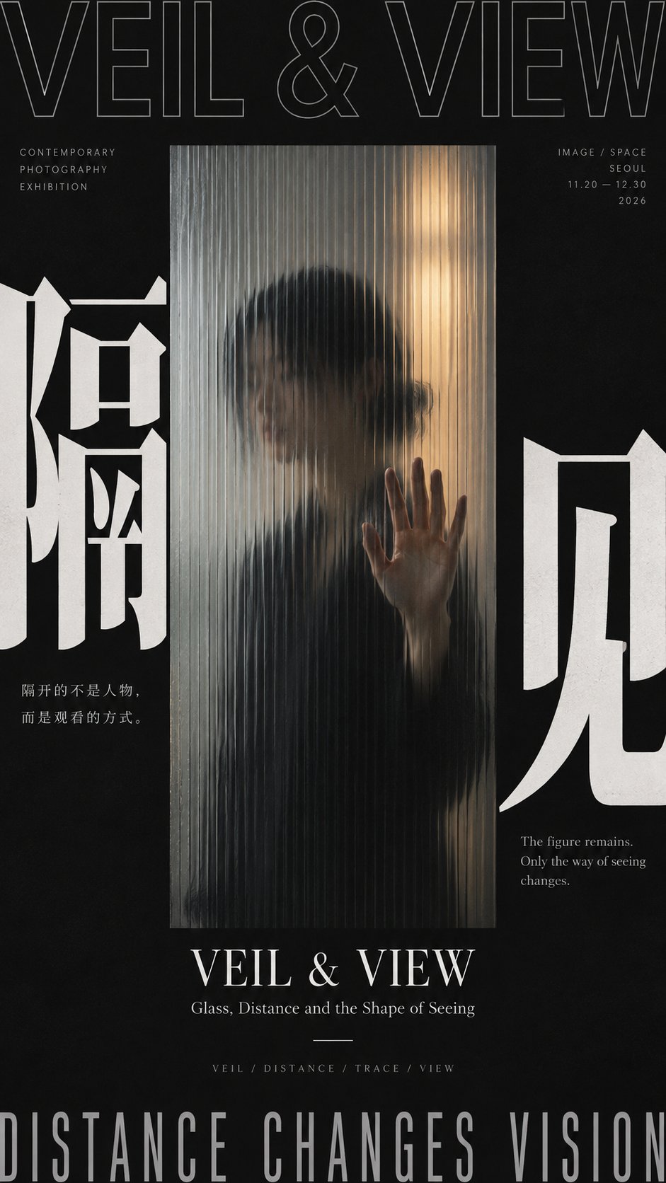
图片来自公开来源,仅作提示词效果参考;正式商用请按来源授权处理。
[Subject]
[Main Visual Subject]
[Core Chinese Character]
[Chinese Title]
[English Title]
[Enclosure Method] Dark edge framing / Circular surround / Time boundary / Real door frame / Others
[Spatial Relationship] Perspective / Blur / Refraction / Rotation / Motion blur / Layers of depth / Others
[Accent Color]
[Aspect Ratio] 9:16

Generate a modern exhibition poster with the temperament of East Asian Modernist Exhibition Poster, Japanese Contemporary Graphic Design, and Editorial Photography. The core adopts "spatial enclosure composition": do not rely solely on text or borders to surround the subject, but use real space, dark edges, circular orbits, photographic cropping, architectural door frames, glass media, motion direction, or perspective structures to build visual pressure and depth from the periphery toward the center, making the center naturally become the focal point of vision. The enclosure relationship must have clear foreground and background layers, avoiding just flat text pasting; methods such as "dark edges clamping a bright window," "circular subject and ring-shaped text forming an orbit," "temporal Typography pressing in from the edges of photography," or "consecutive door frames pointing layer by layer into the distance" can be used to let the enclosure itself generate a sense of space.

First, select the most suitable visual mechanism based on [Subject] and [Spatial Relationship]. Character or photographic themes can use frosted glass, blur, occlusion, and light-dark boundaries to form "dark outside and bright inside"; circular objects can let text run along the circumference, and then use needles, rods, hands, or other real objects to break the closed orbit; dynamic photography can let time, direction, and large characters enter from the edges, then use motion blur to connect multiple areas; architectural themes can directly use door holes, walls, window frames, or corridors to form a real Frame within Frame. Keep only one main mechanism per image; do not mix circular, door frame, glass, and motion blur all together.

Typography must have a real relationship with the space rather than floating on the surface of the image. Use a striking [Core Chinese Character], allowing it to cling to edges, be partially cropped, inverted, refracted by glass, swallowed by dark areas, deformed along a circumference, or occluded by photographic edges; English titles can use Grotesk, Condensed Sans, Outline Sans, or restrained Serif, and be arranged horizontally, vertically, rotated 90°, or along paths according to the spatial structure. Large characters are responsible for establishing boundaries, medium characters for the theme, and small characters retain only the date, location, and minimal information. Do not rely on a large amount of explanatory text to create a sense of complexity.

The image should strengthen real foreground and background layers and spatial direction. Through light and dark, occlusion, scale difference, perspective, blur gradients, reflections, circular motion, or continuous door holes, let the audience clearly feel the visual progression from "periphery → middle layer → center / distance." Retain at least one "frame-breaking" relationship, such as a stylus cutting through circular text, a person's hand being clearer near the glass, a red line stepping out of the photographic boundary, or a distant color block passing through continuous door holes to become the final focus. Keep only 1–2 frame-breaking instances to avoid the image going out of control.

Overall keep the look modern, restrained, and high-contrast. Use neutral colors like cold white, charcoal black, and light gray preferentially for the background, and add only one [Accent Color] according to the theme; the accent color can be used for distant exits, circular centers, time nodes, thin lines, or local light sources, with the total area controlled at about 5%–10%. If photography is used, the photography itself should also maintain a unified grayscale, low saturation, or monochromatic system, and not let commercial color grading, neon, or movie special effects take away the layout logic.

Information density mainly comes from "spatial hierarchy + Typography + subject structure," not from knowledge modules. The central or distant focus must be simpler than the periphery, retaining at least about 25%–35% effective negative space. The periphery can be heavier, denser, and blacker, while the center can be brighter, quieter, and emptier, forming an obvious "dense outside × sparse inside" or "dark outside × bright inside" relationship. Do not add flowcharts, material cards, small image collages, complex parameters, or meaningless descriptions, unless they themselves are an indispensable part of the theme.

The final reading order should be: first eye sees the strong peripheral structure and central spatial focus, second eye understands how the enclosure relationship creates depth or focus, third eye discovers real spatial mechanisms like blur, orbits, motion, door frames, or occlusion, and finally reads the title, date, and minimal information. The entire work should be like a real contemporary photography exhibition, sound art exhibition, architectural exhibition, or independent cultural visual, rather than a regular photo with text, commercial poster, or info sheet.

Avoid: regular full-bleed photography, movie poster feel, cyberpunk, neon effects, tech HUD, complex spectrums, subway maps, mechanical circular frames, average four-sided borders, PPT layout, too much explanatory text, random English, Design Study, Vol., numbering, Logo, QR codes, and copyright marks.