中轴夹景文化海报设计提示词
中轴夹景文化海报设计提示词,适合短视频封面、AI生图、AI视频分镜和内容创作参考。模型:ChatGPT。
AI提示词短视频灵感
中轴夹景文化海报设计提示词,适合短视频封面、AI生图、AI视频分镜和内容创作参考。模型:ChatGPT。
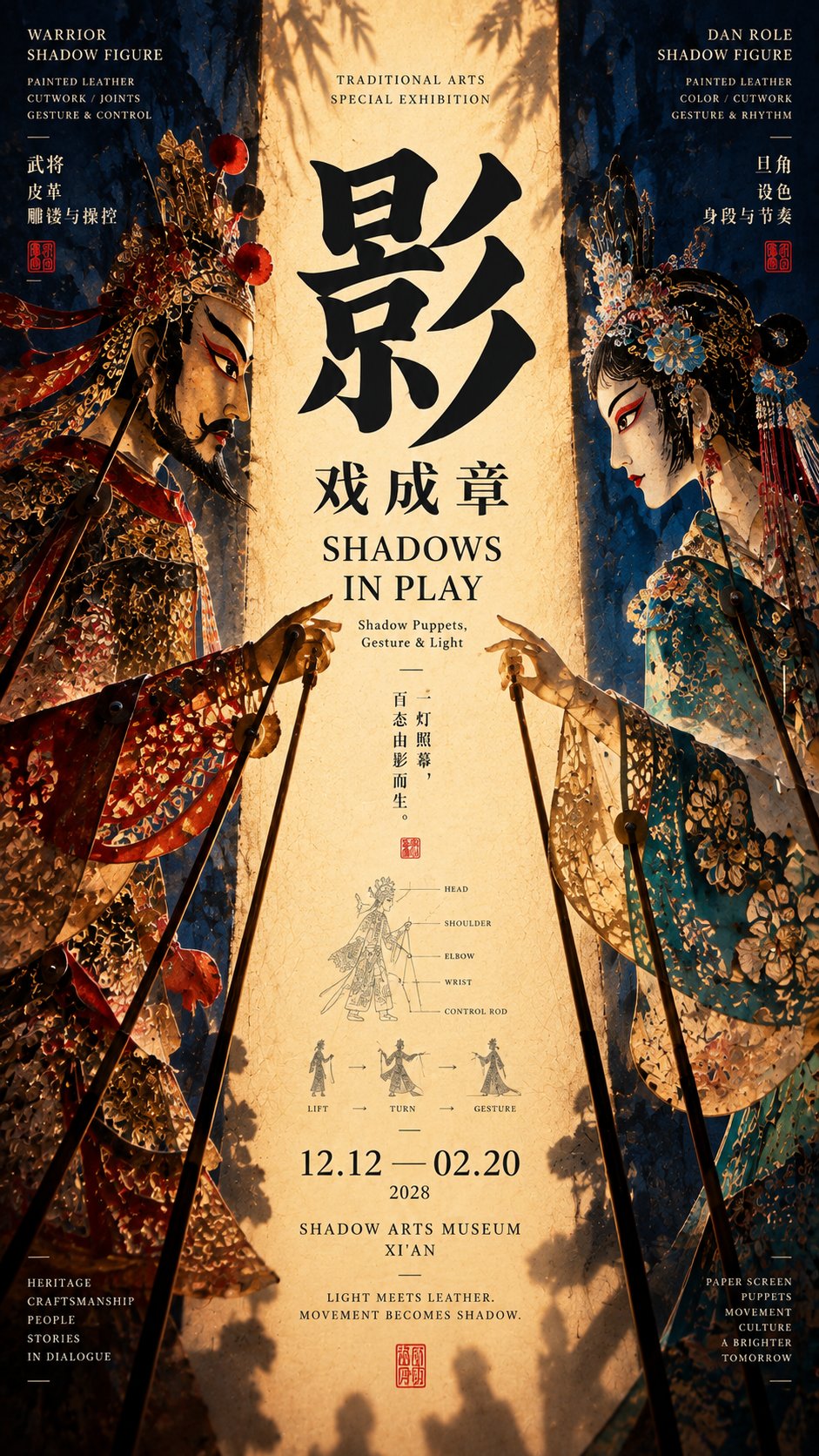
图片来自公开来源,仅作提示词效果参考;正式商用请按来源授权处理。
[Theme]: ____
[Chinese Title]: ____
[English Title]: ____
[Left Visual Element]: ____
[Right Visual Element]: ____
[Left-Right Relationship]: Facing each other / Enclosing / Front and back / Intertwined / Other____
[Central Axis Content]: Light curtain / Path / Needle and thread / Fabric / Negative space / Other____
[Composition Method]: Character action / Outline framing / Spatial perspective / Linear penetration / Intertwined formation / Other____
[Main Tone]: ____
[Auxiliary Color]: ____
[Research Node]: ____
[Aspect Ratio]: 9:16

Generate a "Central Axis Framed Scenery" cultural poster with strong spatial relationships and a mature Editorial Design temperament.

First establish a clear central reading area, and then let the elements on the left and right sides jointly form the central axis through real relationships. The two sides are not just decorative symmetry, but truly participate in thematic expression.

You can choose different relationships according to the subject matter:

Characters facing each other: use character postures, sleeves, poles, or lines of sight to jointly frame the central light curtain or focal point;

Outline enclosing: use umbrella surfaces, buildings, utensils, or natural edges to enclose depth spaces such as rainy alleys, roads, and skies;

Front and back penetration: use the front and back sides of the same object, and pass through the center through real structures such as needles, threads, and rods to connect the two sides;

Linear intertwining: let two sets of lines from different directions meet in the center, gradually forming a complete fabric, pattern, or surface from independent linear elements.

The central axis is not necessarily a color strip; it can be a glowing area, a path of depth, a real needle and thread, a piece of fabric being formed, or even a piece of negative space jointly enclosed by the outlines of both sides.

The visual weight of the left and right sides should remain balanced, but mechanical mirroring is prohibited. Obvious differences can be created through color, posture, material, scale, and outline, as long as both sides ultimately push attention toward the center.

Typography is redesigned according to each theme and can be horizontal, staggered, cross-zone, close to the outline, or slightly interspersed with the real subject. Do not fixedly use four-character vertical arrangements, a single huge character in the center, or the same title template.

Information is concentrated in 2–3 areas, and a small research node with an area of about 5%–7% can be added, such as movement trajectories, structural relationships, stitch marks, opening and closing states, or warp and weft organization, making the image look more like a mature cultural exhibition visual rather than an ordinary decorative poster.

Control the color to 3–5 main colors, prioritizing clear large color gamuts and material contrasts.

At first glance, see the relationship between the left and right subjects and the center; at second glance, read the title; at third glance, discover how the characters, spaces, or lines actually participate in the composition.

Overall requirements: high-definition, clean, clear structure, rich but concentrated information, with Museum Exhibition Poster × Contemporary Editorial Graphic Design × East Asian Cultural Visual temperament.

Avoid: mechanical mirroring, no real relationship between left and right elements, center filled with irrelevant information, fixed title templates, multiple visual centers, random decorative lines, PPT-style information boxes, excessive small text, over-aging, mottled noise, and low-completion AI poster feel.