品牌Logo概念探索设计稿生成
品牌Logo概念探索设计稿生成,适合短视频封面、AI生图、AI视频分镜和内容创作参考。模型:ChatGPT。
AI提示词短视频灵感
品牌Logo概念探索设计稿生成,适合短视频封面、AI生图、AI视频分镜和内容创作参考。模型:ChatGPT。
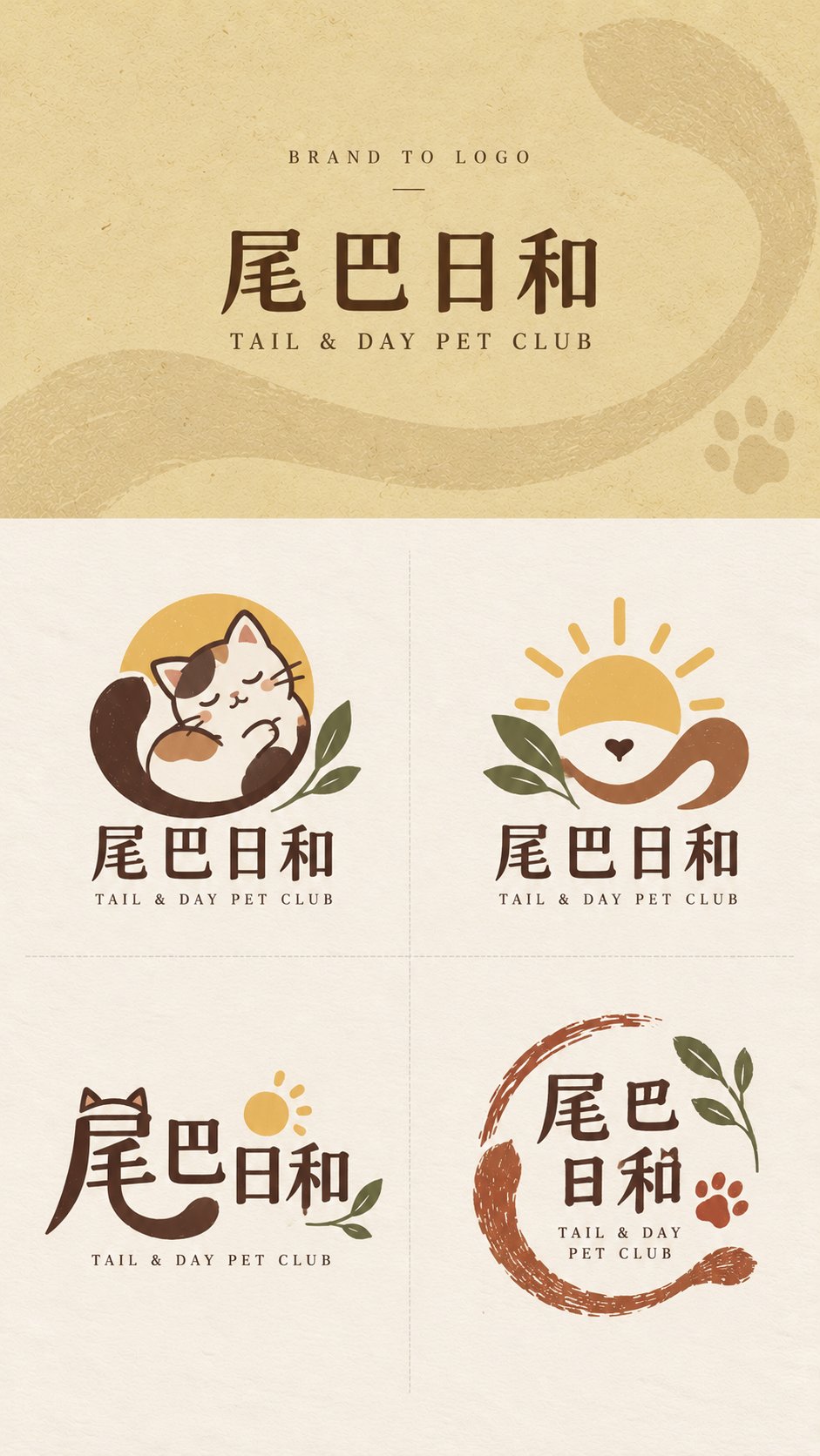
图片来自公开来源,仅作提示词效果参考;正式商用请按来源授权处理。
【Brand Name】: {e.g., Tail & Day}
【English Name】: {e.g., TAIL & DAY PET CLUB}
【Brand Type】: {e.g., Pet lifestyle brand / Flower shop / Catering / Bookstore}
【Brand Keywords】: {e.g., Warm, natural, friendly, handmade feel}
【Core Visual Imagery】: {e.g., Tail, sun, pet companionship}
【Main Color Suggestions】: {e.g., Cream yellow, dark brown, brick red, sage green}
【Top Background Color】: {Fill in according to brand temperament}
【Aspect Ratio】: 9:16

Please generate a complete "Brand to Logo" brand logo concept exploration design draft for the above brand. The core is not simply generating four similar logos, but proposing four truly different visual design routes around the same brand name, industry attributes, and core concepts.

The final image is fixed at a 9:16 vertical version. The top brand input area strictly occupies 30% of the entire image height, and the bottom logo display area strictly occupies 70%. This ratio cannot be changed regardless of the length of the brand name; when the name is long, reduce the font size instead of expanding the top area. The bottom 70% is then strictly divided into 2×2 four equal-sized areas, using only very light and thin dashed lines for separation, without drawing peripheral borders.

【Top Branding Area】

The top is only an introductory area for the original brand information, not a main visual poster. Use [Top Background Color], and add extremely slight paper, washi, wrapping paper, screen printing grain, or low-contrast dark patterns related to the brand to only increase texture without forming complex illustrations.

The top only retains three layers of information:

BRAND TO LOGO

【Brand Name】

【English Name】

The brand name should use a normal, clear, modern printed font, without being pre-logoized, handwritten, or graphically deformed. Do not add slogans, brand descriptions, large amounts of small English text, serial numbers, stamps, auxiliary icons, or complex light and shadow, so that the visual focus naturally falls on the four logo schemes below.

【Bottom Logo Display Area】

The bottom uniformly uses a Warm Ivory warm off-white paper background, retaining only slight natural paper grain. All four logos need to be developed around the [Brand Type], [Brand Keywords], and [Core Visual Imagery], keeping the brand core consistent, but the design methods must be significantly different.

Each logo should be a complete set of brand identity that can be realistically used for stores, packaging, labels, social avatars, business cards, or peripheral products, rather than a full illustration, poster, or decorative image.

Control each scheme within 1–3 primary colors, prioritizing the [Main Color Suggestions]. Avoid high-saturation variegated colors, complex gradients, 3D, metal relief, glass texture, and commercial mockups.

【Mascot | Mascot Type】

Design a highly generalized character or anthropomorphic subject from the brand name, industry, or core imagery. The character needs to have a clear large outline and strong memory points, but do not make it into a complex anime character or a full scene illustration.

Let the character itself relate to the brand concept, for example, holding a product, hiding behind an object, or merging with core plants or animals. Pair it with the complete [Brand Name] wordmark and a smaller [English Name], making it overall friendly, story-oriented, and suitable for social media dissemination.

【Emblem | Imagery Emblem Type】

Do not rely on a full character; instead, extract the 2–3 most important elements from the [Core Visual Imagery] and combine them into a concentrated, balanced brand emblem that is easy to recognize when scaled down.

Prioritize using negative space, surrounding, vertical stacking, partial enclosure, or graphic isomorphism to let different elements truly fuse into one logo rather than simply placing several small icons side by side. Pair it with the brand wordmark to form a complete and stable logo system.

【Type-led | Creative Typography Type】

Take the [Brand Name] itself as the core design object. Analyze the strokes, structures, radicals, negative spaces, and letter outlines with the most visual potential in Chinese characters or English letters, and let the core imagery of the brand grow naturally from within the text.

Omissions, shared strokes, extensions, cutting, partial replacement, negative space reconstruction, or glyph fusion can be performed, but basic legibility must be maintained.

Do not simply stick an extra icon next to a regular font. The focus is to make "the text itself the logo," forming a more modern, clever, and professional graphic design scheme.

【Stamp | Open Handmade Mark Type】

Design a logo with the temperament of a hand-carved, printmaking, shop stamp, or packaging mark, but do not use a regular complete square box, and do not stuff all content into a closed ellipse.

Use incomplete boundaries, open arcs, natural strokes, brand core graphics, or text to jointly form a loose visual scope. Elements can be slightly misaligned, and the edges allow for a small amount of natural ink deficiency and uneven hand-printing to give the overall design a sense of breath.

The Stamp must maintain clear primary-secondary relationships and sufficient white space. Do not become stiff, dense, or difficult to use practically in pursuit of a "stamp feel."

The four types must share the same brand worldview, core imagery, and basic color palette, but they cannot simply be the same logo in four drawing styles or four layouts.

Do not add serial numbers such as A/B/C/D. Do not add slogans, explanatory sentences, or extra information at the bottom. Do not generate packaging mockups, real store scenes, or full illustrations.

The final image should look like a mature, clean, professionally differentiated logo exploration sheet with real brand design value.